
10 great book covers using TN fonts
by Lucas Czarnecki
November 20, 2021
https://www.typenetwork.com/news/article/10-great-book-covers-using-tn-fonts
They say not to judge a book by its cover, but cover designers strive to help readers forget that advice. Here are ten excellent covers that prove the importance of high quality typefaces and typography.
When designing a book cover, you have only a few elements at your disposal: the title and subtitle, the author’s name, fonts, colors, and illustration. Obviously—and this is proven by a visit to your local bookstore—there are only so many ways to combine these elements. When designed poorly, a good book can be lost in the shuffle. When designed well, though—with attention to type, color, and layout—hidden gems can become best sellers.
Since our foundry partners are in the business of creating the highest quality typefaces, it follows that their work would show up on some of the best book cover designs. After looking on our shelves, Type Network staff have picked out ten excellent book covers that use foundry partner typefaces, all of which are available through our catalog:
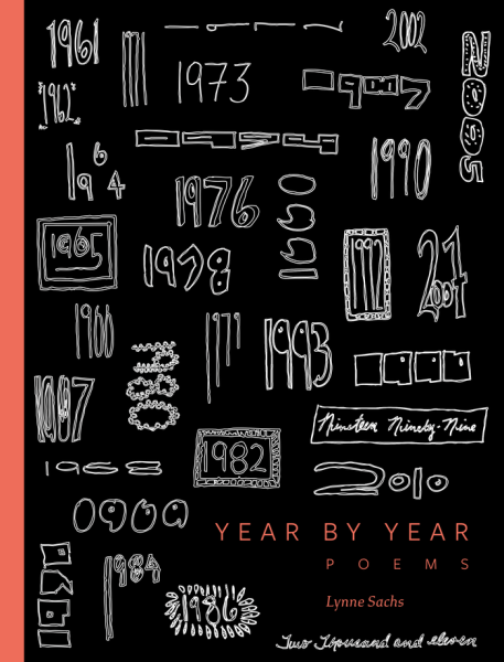
Year by Year: Poems by Lynne Sachs
Study by XYZ Type and Freight Sans by Garage Fonts
Using Study by XYZ Type and Freight Sans by Garage Fonts, this finely doodled cover (created through a collaboration between Sachs and designer Abby Goldstein) cleverly introduces the main content of the book: handwritten poetry over the years. The subdued color palette of black, white, and coral pink draw attention to the type in the bottom right.
Study and Freight Sans both serve well here for their humanist yet refined traits. The book’s interior balances type with handwriting, so firmer or more constructed typefaces might have drained the personality from the book.
Setting the title in all-caps adds prominence and stature, and even though they are tracked out very far, the colored letters of Freight Sans remain legible. Setting “Lynne Sachs” in Study’s calligraphic Italic adds even further warmth to the cover.
The Nightwatches of Bonaventura translated by Gerald Gillespie
Fakir by Underware Type
From the publisher’s website: “First published in German in 1804, under the nom de plume ‘Bonaventura’, The Nightwatches of Bonaventura is a dark, twisted, and comic novel, one part Poe and one part Beckett.”
This cover, for the 2014 University of Chicago Press edition, was designed by Matt Avery and uses Fakir by foundry partner Underware Type and PMN Caecilia by Linotype.
Selecting to set the title in a blackletter like Fakir evokes the early 19-th century German origin of the book; meanwhile, Fakir’s low contrast, sharp cuts, and straight lines draw the reader back into the modern age. The placement (on the other side of a window) and blur on the title “allude to the [book’s] macabre and voyeuristic themes,” writes Stephen Coles.
How to create typefaces by Cristóbal Henestrosa, Laura Meseguer, and José Scaglione
Multi by Type-Ø-Tones
For the English translation of Tipo E’s Cómo crear tipografías, designers Elena Veguillas and Laura Meseguer chose to keep the original’s use of Multi for the title. The cover, bright orange and clear in its content, is a good example of honest, unfussy design.
Multi, published by partner foundry Type-Ø-Tones, was originally commissioned for Dutch newspapers and comes with a factual tone. Choosing to set the title in Multi Display Poster Italic, however, adds a sense of levity. For the target audience, who resent anything too playful and resist anything too dry, the cover (and title) of How to create typefaces strikes a good balance.
Ha, daar gaat er een van mij! (Ha, there goes one of mine!) by Jan Middendorp
Productus by TYPETR
Middendorp’s account of graphic design in the Hague in the latter half of the 20th century is titled after a quote from “R.D.E. Oxenaar, a long-time consultant to the Dutch Mail and designer of Dutch banknotes, who was referring to the agreeable sensation of seeing one’s work come by in daily life,” according to the back cover.
The large “Ha,” combined with the yellow background and white and green quotation marks makes a bold impression and leaves the audience wanting to know more. Designed by Huug Schipper, the cover’s abnormal color palette and its use of the chiseled Productus by foundry partner TYPETR help it stand out in bookshelves and Amazon lists.
Productus is a fitting choice, as the book’s local Dutch focus all but demands a Dutch typeface to accommodate it. Productus does not simply satisfy that requirement, but—at such a large scale—its finer details shine as decidedly Dutch.
O Rio antes do Rio by Rafael Freitas da Silva
Guanabara Sans by Plau
O Rio antes do Rio culminates three years of research into Rio de Janeiro’s pre-colonization history. The cover, designed by Babilônia Editorial, features both Guanabara Sans by foundry partner Plau and Pollen by TypeTogether.
The die-cut letterforms of Guanabara Sans Black reveal an engraving “depicting Rio’s early natives,” hinting to the interior’s robust illustrations. Guanabara Sans Black is big enough for this die-cut technique, while its contrasting Thin weight and the green background combine to create a dynamic and active cover, necessary for a broad-audience history book.
James Joyce series, Vintage Classics
Poetica by Adobe Originals
Published in 2013, this series of covers by Peter Mendelsund for a collection of Joyce’s best literature uses simple, solid colors with Poetica by foundry partner Adobe Originals in off white with thick, handwritten additions over top.
The contrast between Poetica’s flowing yet refined curves and the abrupt black markings reflect both sides of Joyce’s enigmatic writing, mixing the deeply constructed and referential with the eminently human and flawed. The cover for Ulysses was included in the Best Book Covers of 2013 by the New York Times; its handwritten “YES” brilliantly alludes to the character Molly Bloom’s closing soliloquy:
…and Gibraltar as a girl where I was a Flower of the mountain yes when I put the rose in my hair like the Andalusian girls used or shall I wear a red yes and how he kissed me under the Moorish wall and I thought well as well him as another and then I asked him with my eyes to ask again yes and then he asked me would I yes to say yes my mountain flower and first I put my arms around him yes and drew him down to me so he could feel my breasts all perfume yes and his heart was going like mad and yes I said yes I will Yes.
The Vagina Monologues by Eve Ensler
Garage Gothic by Frere-Jones Type
A bold title needs a bold font, so when Time Warner Books published The Vagina Monologues by Eve Ensler in 2001, their designer chose Garage Gothic by foundry partner Frere-Jones Type. The book, which centers female sexuality and its complexity and beauty, didn’t require a loud cover, but one that put the word out there, simply and strongly.
Garage Gothic, unlike other tall, bold gothics, possesses an unvarnished quality; its weathered edges match the cover photo’s heavy shadows, recalling Ensler’s performance version of the title. Garage Gothic is “built from matter-of-fact geometry and softened by hasty printing,” making it perfect for big pronouncements that aren’t cut-and-dry.
Gute Aussichten. New German Photography 2013/14
Designed by agency Pixelgarten, Gute Aussichten is an annual catalog of the best images by young German photographers. The cover pairs Damien by foundry partner Revolver Type with an intentionally unsettling photo of a foot sole being stuck with a needle.
Damien designer Lukas Schneider wrote that the typeface “evolved from a personal preference for pointy shapes, high contrast and straightforwardness,” all of which can be seen in Gute Aussichten’s cover and interior. Its sharp cuts, diamond-shaped details, and alternating rounded and flat curves imbue the cover with a sense of activity, like something more is going to happen.
Finnmarksvidda by Stein P. Aasheim
Satyr by Monokrom
Cataloging the journey of three winters in the interior of Finnmark, Aasheim’s Finnmarksvidda introduces a new literary genre—skietnography—which combines aspects of nature experience, ski expedition, and encounters with indigenous people and culture. The cover, designed by Erlend Askhov, features a section of watery map and uses Satyr by foundry partner Monokrom and FF Legato by FontFont.
The colors—light blue, off white, and dark red—feel at home on the map, while the absence of green and the long red line indicate the desolate, tundra-like environment against which the author’s very human journey takes place. Satyr fits here for both its flowing seriousness in roman and its calligraphic humanism in italic. The title, thanks to its K and V, demonstrates Satyr’s italic most beautifully; meanwhile, the subtitle’s casual introduction of neologism skietnografisk shows off Satyr’s open-looped g and classic fi ligature.
Luchtfietsen (Treading Air) by Jaan Kross
Bodega Serif by Greg Thompson
This cover of Harvill Press’s 2003 edition of Jaan Kross’s acclaimed Luchtfietsen was designed by Tessa van der Waals. The underrated designer and book caretaker decided to use a gloomy Estonian painting, setting the title across the top in bright blue Bodega Serif by foundry partner Greg Thompson.
Bodega Serif, originally released in 1990, borrows several ideas from the high period of Art Deco, adding a nostalgic European charm to the book’s ironic title and tragic content—an apt contrast reflected in the cover art itself.
To stay current on all things TN, subscribe to Type Network News, our email newsletter featuring font analysis, designer profiles, type and design events, and more.